Fall 2024
Beer Labels
Rooted in Ottawa’s Cultural Legacy
The National Gallery of Canada served as the cornerstone for the concept behind these beer can labels. Its iconic architecture and breathtaking glass ceiling sparked a creative exploration of light, geometry, and cultural significance. By incorporating these elements, I aimed to create labels that not only celebrated Ottawa’s rich history but also felt modern and timeless.


Crafting Mosaic-Inspired Masterpieces
The first design draws from the intricate mosaic pattern displayed in the gallery’s glass ceiling, reimagining it in bold, vibrant tones. The geometric shapes were carefully balanced to convey both complexity and harmony, reflecting the craftsmanship of the gallery itself. The second label, Prism Pale Mosaic, incorporates prismatic reflections to emphasize light play, creating a dynamic and eye-catching visual that pays homage to the space’s artistic essence.
Bridging Art, Architecture, and Community
Each label captures the spirit of Ottawa and connects it with the craft beer community through thoughtful design. By blending historic architectural inspiration with contemporary aesthetics, these labels tell a story of creativity and local pride. They are not just packaging but a canvas that invites drinkers to appreciate the artistic details behind every sip.

Step by Step: Project Timeline

Mood Board
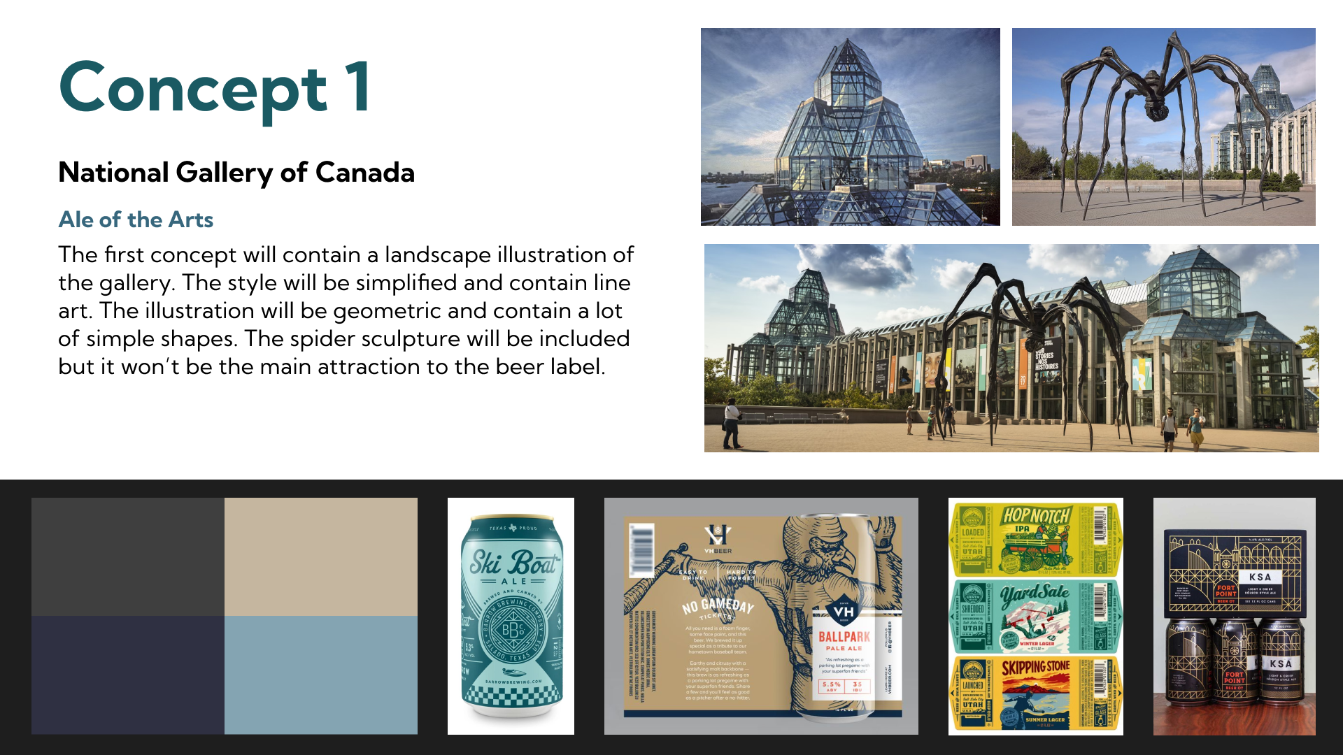
To establish the visual direction, I curated a mood board inspired by the National Gallery of Canada. It featured architectural details like the geometric glass ceiling, iconic spider sculpture, and a neutral yet sophisticated color palette. This foundation helped define the modern and artistic tone of the label design.

Sketches
I began with line-art sketches of the National Gallery’s structure, focusing on its angular shapes and repeating patterns. These simplified illustrations emphasized the building’s architectural beauty while keeping the design minimal and approachable for a beer label.

Final Mockup
The finalized label incorporated the clean geometry of the sketches, paired with a soft beige background and bold red typography for contrast. The design balances simplicity and elegance, creating a contemporary label that reflects both the gallery's artistic influence and the craft beer’s premium quality.

Mood Board
The mood board draws inspiration from the symmetrical patterns of the National Gallery of Canada’s iconic glass ceiling. It features geometric designs, minimalist patterns, and a muted yet bold color palette of beige, black, mustard, and teal. The aim was to convey a modern, artistic feel while maintaining subtle references to the gallery's architectural beauty.

Sketches
Initial sketches focused on capturing the symmetrical nature of the gallery’s glass ceiling, experimenting with repeated shapes and radial patterns. The designs were kept simple to reflect the clean, structured geometry seen in the architecture. These early drafts helped refine the concept into a striking pattern that balances intricacy and clarity.

Final Mockup
The final design brings together the geometric pattern and refined color palette, creating a sleek, modern design. It subtly nods to the National Gallery of Canada while maintaining a clean, cohesive look that appeals to both craft beer enthusiasts and art lovers.

